Fictory
Empowers ESL learners to write creatively and confidently in English through AI-assisted storytelling.

Overview
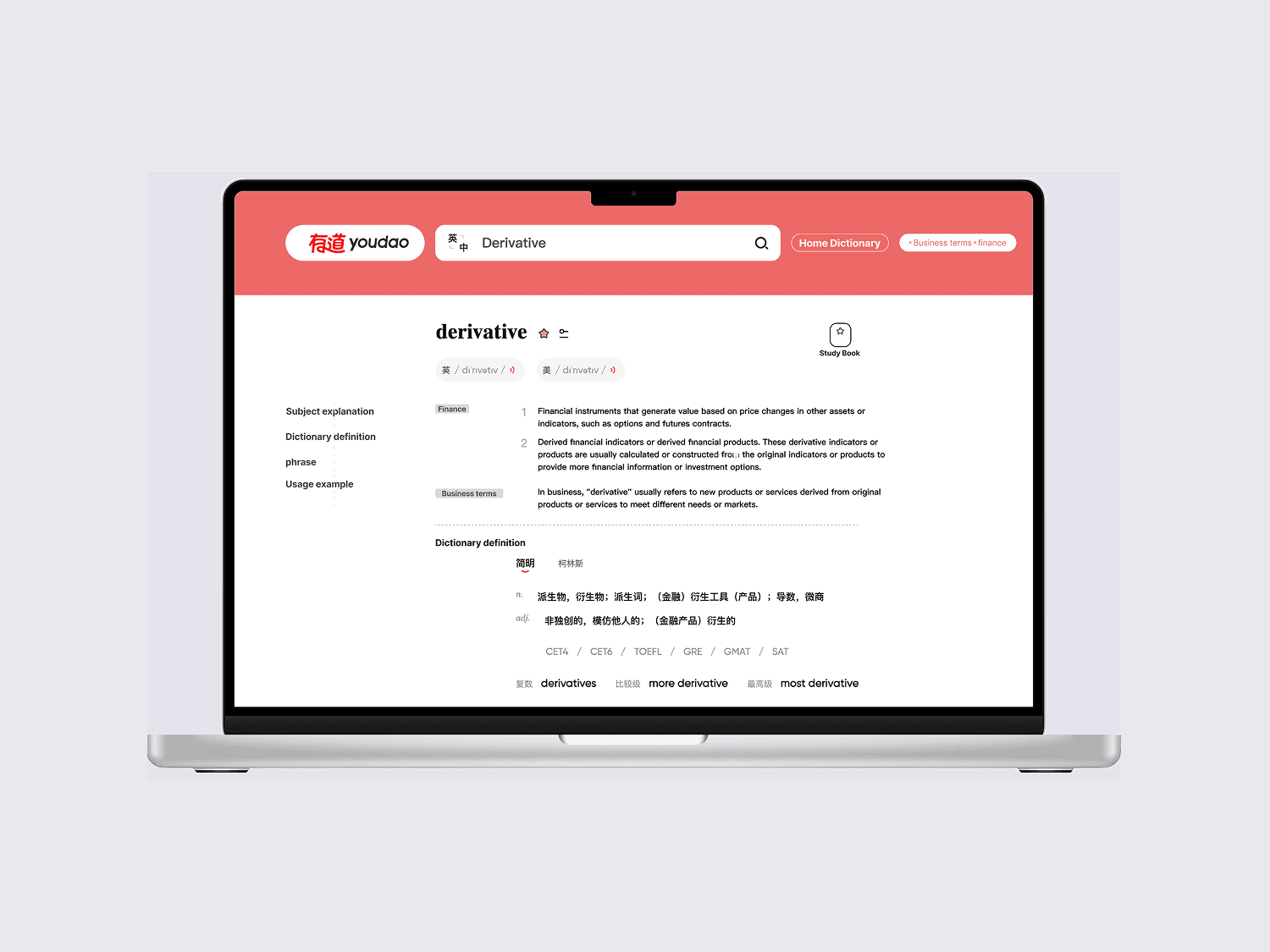
Fictory is an AI-powered writing platform designed to help intermediate and advanced ESL learners develop their creative and expressive writing skills in English. Unlike traditional grammar checkers or language learning apps, it uses contextualized learning and collaborative AI storytelling to help learners bridge the gap between basic correctness and sophisticated self-expression. The platform combines structured writing exercises with intelligent feedback, allowing users to explore and develop their unique voice while receiving targeted guidance on language nuance, tone, and style.
The Problem
This project began with a broad goal—improving educational tools for ESL learners—but turned into a much deeper exploration: how do we help non-native speakers write more creatively, not just correctly?
The hardest part was bridging learner needs, pedagogical theory, and AI feasibility into one cohesive experience.
The Solution
AI-powered creative writing platform combining structured storytelling exercises with intelligent language feedback
Collaborative story creation system where users write alongside an AI partner that provides contextual suggestions and corrections
Unique focus on developing creative expression beyond grammatical accuracy
Helps ESL learners explore writing styles, experiment with tone and voice, and build confidence
Get help with grammar, tone, or idea expansion

Write freely, revise thoughtfully
Visualize your writing journey
My Reflection
Reflection 1: On Ownership & Leading Through Ambiguity
Looking back, this wasn’t just a project—it was a test of ownership. There was no brief that told me “go build an AI writing tool based on fanfiction.” We started with a vague topic—educational literacy—and a team of smart but uncertain people. No one knew where to begin. So I stepped in.
I started with what we did have: scattered opinions, blurry pain points, academic papers, and my own instincts as a second-language learner. Piece by piece, I helped our team map what wasn't working in existing tools, framed research into usable design principles, and proposed a product concept that felt fresh, focused, and grounded in real needs.
It wasn’t about having all the answers—it was about asking the right next question every step of the way. I kept showing up, connecting dots, synthesizing complexity, and making things concrete when they were still foggy. I think that’s what ownership really looks like—not controlling everything, but moving the work forward even when no one else is sure how*.*
Reflection 2: On Reframing, Rebuilding, and Getting It Right
I used to think “iteration” just meant tweaking things until they felt better. Now I know it’s a lot messier—and a lot deeper.
After our first usability test, I thought I had a clear solution: just let users edit freely and keep writing. But when the engineers explained why that would break the AI model, I hit a wall. A few years ago, I might’ve taken that as a dead end. But this time, I took it as a signal: I needed to reframe the problem.
What we were really solving wasn’t just “editing”—it was how to preserve story flow while respecting the tech’s limits. That mental shift helped me reapproach the design not as “what I wanted” but “what’s actually possible and helpful.”
So I rebuilt. Again. I tried three different paths, tested each one, and weighed the tradeoffs not just from a design angle, but also from feasibility and cost. The version we landed on wasn’t perfect—but it was the smartest version we could ship.
And that’s what I’m proud of: not just that I designed something nice, but that I kept going until it truly worked—for users, for engineers, for everyone.
From Gut Feeling to Grounded Direction:
How I led a team from messy curiosity to a differentiated solution ESL learners actually need.
Initial Product Hunch
I Had a Feeling—But Knew We Had to Test It
Before we had a product idea, we had a shared itch. As an advanced ESL learner, I often felt frustrated with writing—especially academic or opinion pieces. While speaking apps were everywhere, tools that actually helped learners improve their expressive writing felt... nonexistent.
So when our team came together to explore “language learning,” I floated a possible angle: what if we focused on intermediate to advanced learners and helped them elevate their written English? Not just fix grammar, but guide how to structure arguments, develop opinions, and find their voice.
It wasn’t a decision—it was a starting point. I made it clear that this was just a hypothesis. If we wanted to build something meaningful, we’d need to test whether this was a real pain point, and whether it was big enough to design for. That’s when we kicked off research.


User Interviews
The Deeper We Listened, the Clearer the Gaps Got
We started with user interviews—talking and advanced ESL learners. I focused our questions around one core tension: “What happens when you try to express a complex opinion in English?”
That one prompt opened the floodgates. Learners shared how they often knew what they wanted to say—but didn’t know how to say it well. Words like “frustrating,” “awkward,” and “unclear” came up repeatedly. One person even said, “I just give up saying anything nuanced.”
Instead of surface-level problems like vocabulary, we heard layered pain points:
Lack of vocabulary nuance
Trouble switching between formal/informal tone
Struggling to express original thinking
We turned those quotes into early problem clusters. That was our first real signal: we weren’t just imagining this need—it was real, specific, and painful.

Competitive Scan
We Mapped the Market—and Realized No One Owned This
Once we knew what learners struggled with, we looked outward: who else was solving this?
We ran a competitive scan. On one side were grammar checkers like Grammarly and Ginger—good for fixing mistakes, but totally flat on structure or creativity. On the other side were fanfic or journaling tools like Sudowrite and Anfic—fun, but without language learning scaffolds.
I led the team to analyze these tools’ feature sets against our users’ pain points. One insight stood out: Most tools helped users use language. None helped them grow as thinkers in the language.
That gap—between correctness and expressive thinking—was wide open. We didn’t yet know how to fill it, but now we had a wedge no one else was claiming.

Pedagogical Deep Dive
We weren’t ready to jump into features. We still needed to answer: What actually works for this kind of learner? So I turned to pedagogy.
I dug into academic literature and discovered something surprisingly practical: the PACE model (Presentation → Attention → Co-construction → Extension), which outlined how learners internalize new ways of thinking in writing. I also studied Nicole Mills’ work on contextualized learning—it emphasized using real topics and personal meaning to build language skills.
As I compared theory with our interview insights, a pattern clicked. Techniques like storytelling, peer feedback, and reflection didn’t just sound good—they directly addressed the gaps we’d heard around nuance, register, and voice.
We hadn’t decided on a product yet. But I proposed a learning engine anchored in one idea:contextualized learning—language growth rooted in personal, relevant expression.
Propose Learning Direction
We Still Didn’t Have a Product—But Now We Had a Spine
At this point, we still hadn’t picked a format, feature, or medium. But after weeks of interviews, research, and mapping pain points, I proposed the first thing that felt like a foundation: Let’s build around contextualized learning.
I didn’t mean a lesson plan or worksheet—I meant a principle. Whatever we built, it had to give learners authentic topics to write about, freedom to take a stance, and enough structure to grow.
I shared a short proposal doc that linked user insights, competitive gaps, and pedagogical research. When I walked the team through it, something changed: we stopped spinning in circles and started anchoring our brainstorms.
Contextualized learning wasn’t the product. But it gave us direction—and a filter for what mattered.
Chapter 2: From Loose Ideas to a Tested Learning Engine:I Prototyped, Reframed, and Rebuilt Until It Worked
From Loose Ideas To a Tested Learning Engine: I prototyped, reframed, and rebult until it worked
Solution Exploration
I Didn’t Want Another Duolingo—So I Looked Elsewhere
After proposing “contextualized language learning” as a direction, I started thinking through what that might actually look like in a product. I mapped out three ideas with the team — a VR dialogue simulator, a collaborative story writing platform, and an AI storytelling tool. Each had unique advantages and tradeoffs, but all circled around the same north star: giving intermediate ESL learners space to explore and create in English without slipping into fear of getting things “wrong.”
The AI storytelling assistant idea stood out. It offered both structure and play, and had the potential to scaffold creative writing while nudging learners toward academic clarity. But it wasn’t a decision yet — it was a starting hypothesis. I knew we’d need wireframes, testing, and lots of iteration to shape it into something real.

Wireframe Exploration
The First Sketch Looked Fine—Until I Imagined Using It
I began with what seemed like a straightforward idea: a tabbed interface. Each function—“Setup,” “Write,” and “Feedback”—had its own tab, and the main content window shifted depending on what the user selected. But as soon as I imagined learners actually using it, I saw a problem: constant tab switching broke the flow. There was no way to reference AI feedback while writing, and the story context kept disappearing. It was too segmented for a creative task.
Then I explored a split-screen layout—writing on the left, AI feedback on the right. This solved the visibility issue, but raised another: Where would story setup live? Also, there was no space for learners to track revisions or reflect on growth over time. The interface still felt like it was forcing users into a rigid system.
These frustrations led me to what eventually became the foundation of Fictory’s core interaction: a tri-panel layout. Setup lives on the left, the writing canvas is centered, and contextual AI feedback is on the right. This structure allowed learners to see everything at once—while staying in control of their voice and ideas.


Key Design Decisions
The Moment I Realized Our AI Was Talking Too Much
Decision 1: During early wireframing, I realized our platform’s main creative writing feature lacked a moment of pause. Users would finish a sentence, AI would generate something, and… that was it. There was no feedback loop, no real reflection.
I redesigned the interaction to include a 25-step turn-taking system — pairing each user submission with a short AI reflection + stylistic breakdown before moving on.

Decision 2: Another issue: when users selected a chunk of text for review, our original AI comment box wasn’t intuitive. It was cluttered, robotic, and didn’t allow learners to ask for the kind of help they actually needed (grammar? tone? ideas?).
I redesigned it into a modular AI tutor bar, where users could choose why they wanted help — e.g., “grammar” or “expand idea” — then hit “analyze.” This gave learners agency, helped them frame their own needs, and made the tool feel more collaborative, less judgmental.

Usability Testing
Users Didn’t Want Help—They Wanted Control
After we launched the first interactive prototype, I was excited to see users really engaging with the co-writing experience. But it didn’t take long before two major complaints surfaced.
First, they felt like they lost control of their own story once the AI stepped in. Second, they were confused—where was the tutorial? How were they supposed to use this thing?
These insights led to one key theme: users wanted control — especially over their own story arc. Even in a co-writing tool, they needed to feel like the author.

💡
"The feedback is
useful, but it's hard
to apply directly."
💭
"I don't feel like I'm writing
—just reading what the AI
wrote."
📝
"I wanted to add
relationship tags like
on AO3."
Interface Feedback
💡 What We Learned
Writers need editable AI suggestions
I turn fuzzy ideas into clear next steps—and get them over the finish line. With a bias for action and a love of structure, I break down complex UX problems into real sprints, real momentum, and real results. Vision matters. So does getting it done.
Flexibility to regenerate or revise content is essential
My friends laugh at how I can't help analyzing everything – I'm the one pausing mid-conversation to point out a coffee shop's confusing layout. My analytical mind automatically deconstructs problems into component parts, mapping cause-effect relationships others miss. When researching, I build evidence chains that reveal those "aha!" connections, like solving puzzles with pieces scattered across different user stories.
Story control = writer engagement
I genuinely enjoy being the person who helps different team members understand each other. I get a kick out of translating technical constraints into design opportunities, or helping stakeholders see the human story behind the user data. My friends tease me about how quickly I can shift from "designer speak" to "developer talk" in meetings. But honestly, seeing those moments when everyone finally gets on the same page makes all the effort worthwhile.
Iteration
Three Iterations, One Aha Moment
So I rolled up my sleeves and started exploring options.
My first idea? Just let users edit directly in place. They could freely tweak anything they or the AI had written, and then continue the story from there. It looked smooth on the surface, but when I shared it with the engineers, they immediately pushed back.
They explained that every inline edit would force the system to reprocess the entire conversation history just to keep the AI context updated. That meant huge token waste, slow response time, and scalability issues. Basically, the design was elegant—but not feasible.
Back to the drawing board.
Next, I came up with Option B: redirect users to an Edit page. It was cleaner technically: users could hit “Edit,” fix their content in a separate screen, hit “Save,” and we’d handle the updates behind the scenes. It solved the backend problem—but introduced a new one: it disrupted user flow. During testing, people felt yanked out of their creative rhythm and complained that it broke their writing momentum.
At that point, I knew we needed a third way—something that balanced usability with feasibility.
That’s when Option C clicked. What if we allowed users to highlight just the part they wanted to revise, edit that snippet in place, and then hit save? Behind the scenes, we’d simply send a lightweight update tag to the AI model—just enough to tell it what changed, without re-sending everything. Minimal token cost. Minimal latency. And most importantly, no flow disruption.
Once I showed the team how this solution worked—why it gave users freedom without blowing up our backend—they were on board immediately.
Option C became the version we shipped. And honestly, I think it’s one of the most satisfying tradeoffs I’ve ever designed.

From Final Pixel to Final handoff - How I Took Ownership of the Last Mile
Design Handoff Preparation
Before Sharing My Designs. I Made Sure There Were No Loose Ends
When it comes to handoff. I've learned the worst thing you can do is assume people "get it." So before sharing anything with devs, I always walk through my files as I'm seeing them for the first time.
I cleaned up layers, labeled components, linked relevant flows, and documented edge cases. I also made sure the interactions were clear - if it moved, glowed, or changed states, I showed it. The goal wasn't just clarity, but confidence. I wanted the team to feel like nothing would get lost in translation.

Collaboration with Developers
Instead of Throwing My Files Over the Wall, I stayed in the Loop
Handoff doesn't end when you click "Share." I scheduled a live walkthrough with the dev team to walk through the key flows, answer questions, and flag any tricky edge cases.
Even after that, I stayed in the loop - answering async questions, reviewing staging builds, and tweaking micro-interactions when needed. I see design and development as a relay race, not a baton toss. Good handoff means fewer surprises and better outcomes for everyone


Selected work
[2022 -2025]