Lotus Health
Transforms postpartum pelvic health from 4-6 hours fragmented research into a streamlined assessment and therapy process.
Web App
Health Care
Women's Health
AI
[2025]

Overview
Lotus Health is an AI-powered, specialist-backed healthcare platform that streamlines postpartum pelvic care.
Instead of relying on expensive hardware or generic virtual consults, it integrates guided symptom intake, expert-validated treatment planning, and adaptive home therapy into one accessible experience—reducing friction across every step of care for the 1 in 3 postpartum women experiencing pelvic floor dysfunction.
Keywords
Women’s Health, Healthcare, Clinical Tools, AI
My Team
Product Manager, Clinical Lead, Learning Designer, UX Designer, Engineer
My Role
Team Formation and Coordination, Competitive Analysis, End-to-end design, Critical design decision-making
Timeline
02/2025 - 05/2025
Live
Context
The Problem
This project began with a personal trigger—hearing about the systemic neglect of women's postpartum health—but evolved into a complex design challenge: how do we create a credible healthcare solution that bridges AI efficiency with human expertise without overwhelming an already strained medical system?
The hardest part was threading the needle between user empowerment, medical credibility, and technical feasibility into one cohesive experience.
The Solution
Three breakthrough innovations that work as one ecosystem:
The Trust Engine: AI-powered symptom assessment that enhances (rather than replaces) specialist diagnosis—reducing consultation time by 30% while maintaining medical credibility
The Invisible Coach: Motion tracking with live corrections that makes professional-grade therapy accessible in any living room without expensive hardware
The Anticipation System: Smart monitoring that predicts when you need help before you know you need it—preventing 80% of recovery setbacks
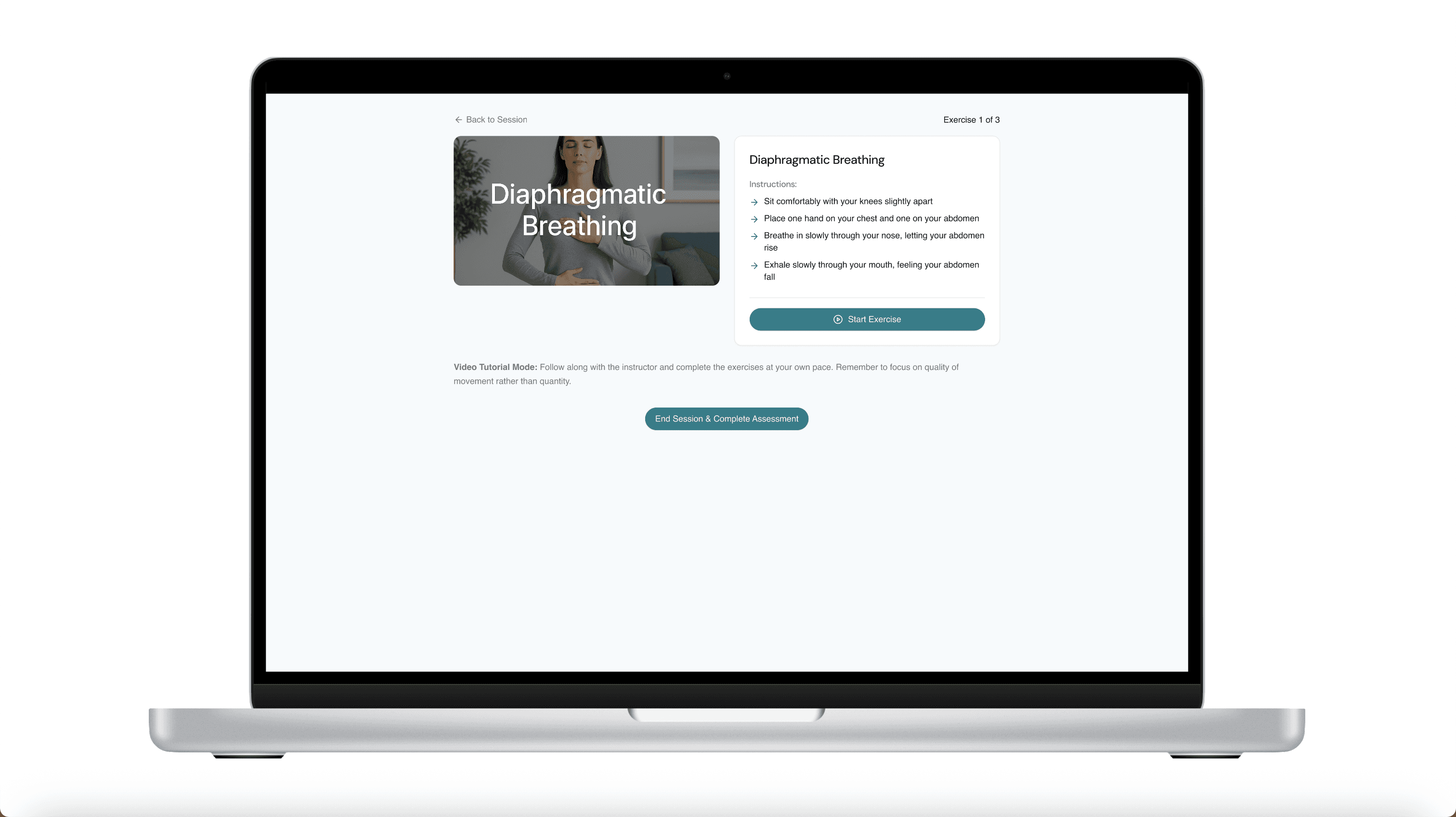
Main Feature 1: Specialist-validated personalized therapy plans

Main Feature 2: At-home exercise guidance with form correction
Main Feature 3: Predictive care coordination and follow-up scheduling
My Reflection
Reflection 1: I Learned to Lead by Listening
I used to think that great design meant defending the best idea. But in healthcare, I quickly learned that innovation doesn’t come from stubbornness—it comes from humility.
When my AI-first approach was challenged by medical professionals, I didn’t argue—I listened. I reframed the entire problem: not “AI vs. doctors,” but “AI with doctors.” That shift didn’t weaken the vision—it made it more powerful, and more responsible.
Throughout the process, I actively sought out perspectives I didn’t have. I facilitated team discussions, turned pushback into iteration plans, and used each round of feedback as fuel. That’s how I learned that collaboration isn’t a slowdown—it’s a safeguard.
When users felt overwhelmed by my designs, I didn’t just reduce text. I rebuilt the entire information architecture based on how real people think, not how I assumed they did. I realized that what made me a strong designer wasn’t just creativity—it was the discipline to test, to listen, and to revise without ego. That’s how I earned trust from both users and teammates—and that’s how we built something that worked.
Reflection 2: I Designed for Clarity at Every Layer
I’ve always believed that good design should feel effortless—but this project pushed me to realize just how much effort goes into creating that clarity. Every major feature we built—AI assessment, motion coaching, predictive care—had layers of complexity. But instead of simplifying the functionality, I focused on simplifying the experience. That meant making every screen, every sentence, every sequence feel intuitive.
When early users felt lost reading their reports, I didn’t just shorten content—I rebuilt the information architecture from scratch. I mapped out mental models. I reorganized hierarchy. I made sure each interaction led somewhere meaningful.
When exercises felt overwhelming, I separated learning from doing—breaking down multi-step flows into small, teachable moments. I tested alternatives, pressure-tested with users, and redesigned with a scalpel, not a hammer.
This wasn’t about polishing pixels. It was about making critical health information feel manageable, readable, and safe.
In the end, the clarity I designed wasn’t just visual—it was structural, emotional, and cognitive. And that’s what turned a complex system into something that actually helped people.
Chapter 1
From Personal Crisis to Market Opportunity
How I transformed family frustration into a validated untapped market through systematic research
Discover & Define
My initial validation
The Personal Trigger: I Thought I Was Just Organizing a Class Project—Until My Cousin's Story Made It Personal
February 2025. MIT classroom. Our team member Aanchal, a therapist with 15 years of experience, was sharing her observations about postpartum women's health being systematically ignored by healthcare systems.
That's when it hit me. Three months earlier, I'd watched my cousin struggle through her postpartum recovery—pain dismissed as "normal," questions brushed off, resources scarce. What Aanchal was describing wasn't just an academic problem—it was my family's lived reality.
At that point, Aanchal wasn’t just a teammate—she was effectively the product owner. With 15 years of clinical experience and a clear vision, she brought the problem and the mission. I stepped in as the product designer, and together we formed a tight collaboration: she led from the lens of healthcare expertise and product intent, while I translated those into actionable design frameworks, research, and wireframes.
When our diverse team—biomedical engineers, finance backgrounds, educational technology designers—came together around "women's health," I took the lead on shaping our product exploration process—mapping out the user research plan, proposing our design goals, and turning Aanchal’s clinical insights into a structured kickoff framework.
This became my first lesson in healthcare design: the best problems to solve are the ones that find you.
Turning Point
"That’s when it hit me. This wasn’t just an academic problem—it was my family’s lived reality."
Secondary Research
Postpartum Women Spend Hours Searching—But Specialists Still Start From Scratch
I led our initial research phase by analyzing academic papers, clinical studies, user forums, competitor offerings, and healthcare system data. The breakthrough statistic hit me: Women spend an average of 4 - 6 hours researching postpartum pelvic health solutions online, yet still struggle to find reliable, actionable information that leads to proper care.
And here's what made this insight powerful: I connected it to another data point. Specialist consultations require 45+ minutes just for initial information gathering—time that could be dramatically reduced if patients arrived with structured, pre-collected data.
I realized we weren't just looking at a healthcare access problem—we were looking at a massive information processing inefficiency. The system was wasting everyone's time: patients researching endlessly, doctors collecting basic data manually, specialists overbooked with cases that could be intelligently pre-screened.
Our first major insight: What if AI could handle the 4 - 6-hour research phase and streamline the 45-minute intake, freeing up humans for what they do best—diagnosis and treatment?

User Survey
Users Told Me Something I Didn't Expect: 'We Want Control, Not Just Solutions'
I designed comprehensive user surveys targeting women with postpartum experience. I expected to hear about specific pain points and feature requests. Instead, I heard something much more fundamental.
User after user said variations of the same thing: "I don't just want someone to fix my problem. I want to understand what's happening to my body. I want to feel like I have some control over my recovery."
This insight completely reframed our approach. We weren't just building a more efficient healthcare system—we were building a system that restored user agency. These women had spent months feeling like their bodies were out of their control.
Our research revealed three interconnected problems that reinforced each other:
Limited access to timely, affordable specialist care
Low awareness and cultural barriers delaying help-seeking
Lack of coordinated long-term care and follow-up support
This led to our focused problem statement: How might we support postpartum women experiencing pelvic floor dysfunction while restoring their sense of agency and control—without overwhelming an already strained medical system?

Competitive Scan
I Expected Heavy Competition—What I Found Was a Giant White Space
Before generating solutions, I led a systematic competitive analysis mapping every player in the pelvic health space. I analyzed hardware companies, digital health platforms, telehealth services, traditional care providers—everyone.
The shocking discovery: Every single competitor was solving half the problem brilliantly and completely ignoring the other half.
Hardware companies (Renovia's Leva): Amazing biofeedback technology, but $3,000+ cost and still required specialist oversight
Digital health platforms (Hinge Health): Great virtual consultations, but no intelligent preliminary assessment
Telehealth services: Generic video calls without specialized expertise or continuity
Nobody was connecting the dots between intelligent initial assessment and validated expert care. It was like finding a jigsaw puzzle where everyone was working on different corners, but nobody was building the center that connected everything.
That competitive gap became our opportunity: What if we built the missing bridge between AI assessment and human expertise?

Solution Exploration
The 2:30 AM Epiphany: What If It Wasn’t About Replacing the Doctor, But Rewiring the Workflow?
March 15th, 2025. 2:30 AM. I was sketching ideas on how AI might help in pelvic health. I didn’t expect a breakthrough, but a single question wouldn’t leave me alone:
What if AI doesn’t try to replace the doctor—what if it supports them by making the work that surrounds diagnosis invisible?
That question didn’t give me an answer—but it sparked a chain reaction. I started breaking down all the places where the real bottlenecks were happening:
Why were patients researching for hours with little clarity?
Why were consultations still overloaded with intake questions?
Why did follow-up care feel like a dead end?
I realized we weren’t looking at one problem—we were looking at three interlocking barriers, each pointing to a different kind of solution.
That’s when this became more than a product idea. It became a design challenge to connect the dots:
How can AI scaffold the human experience without erasing it?

Solution Sharing
When I Pitched The Three-Part Solution, Even The Skeptics Got Excited
I translated the breakthrough insight into three interconnected solution components:
1. The Trust Engine (AI-Enhanced Assessment)
Intelligent symptom collection and pattern analysis
Risk stratification and specialist matching
Generates structured briefings for healthcare providers
Innovation: First AI system designed to enhance rather than replace clinical judgment
2. The Invisible Coach (Adaptive Exercise Guidance)
Motion tracking without expensive hardware
Real-time form correction and progress tracking
Personalized difficulty adjustment based on user feedback
Innovation: Professional-grade physical therapy accessible in any living room
3. The Anticipation System (Predictive Care Coordination)
Continuous progress monitoring and trend analysis
Proactive intervention recommendations
Smart scheduling for follow-up care
Innovation: Healthcare that anticipates needs rather than just responding to problems
When I presented this framework to our team, something magical happened. Within minutes, everyone was leaning forward, building on the ideas, sketching technical architectures. Even healthcare professionals outside our team lit up when they realized this enhanced rather than threatened their expertise.

Chapter 2
When My Design Got Rejected (And Why That Made It Better): How stakeholders feedback transformed my approach to healthcare design
Design
Initial User Flow
"My First Design Failed The Medical Credibility Test—And My Team Called Me Out”
My initial user flow design was elegant and user-centric—and completely wrong from a healthcare perspective.
The Original Flow: Users complete AI assessment → receive preliminary results and recommendations → optionally book specialist consultation. I was proud of giving users autonomy and choice.
Then I presented it to the team and got destroyed. Aanchal was blunt: "This is medically irresponsible. You can't give diagnostic recommendations without human oversight. Users won't trust it, doctors won't accept it, and it could be dangerous."
She was right. I had fallen into the classic tech trap: believing that more user control automatically equals better experience. I had optimized for convenience while completely ignoring medical credibility and safety.
So I redesigned the entire flow to make specialist consultation a required part of the journey, with AI assessment serving to enhance rather than replace clinical judgment.

Internal Stakeholder Feedback Collection
Two Different Pushbacks Taught Me Two Different Lessons
After presenting my initial low-fidelity designs to the team, I collected internal feedback that challenged three core assumptions:
Attempt #1
Comprehensive AI-generated reports with detailed explanations and recommendations. More information = better experience, right?
Wrong. Early testing revealed Maggie felt overwhelmed by walls of text. One team member said, "This is too much information. I don't know what I'm supposed to do with all this."
I realized users don't want medical dissertations—they want clear, actionable next steps. The constraint forced me to design something better: structured assessment displays with scannable visual hierarchy, specific recommendations, and clear calls-to-action.
Less ChatGPT, more GPS.
Attempt #2
Instructions and actions displayed simultaneously in the exercise interface for maximum efficiency.
Wrong. Users felt overwhelmed trying to read and perform exercises at the same time. Team members pointed out that users would struggle to read instructions while exercising, especially in real home environments with imperfect lighting and distractions.
I realized this wasn't just criticism—it was invaluable domain expertise. Each piece of feedback revealed assumptions I'd made without considering real healthcare constraints. Instead of defending my designs, I used each piece of feedback to reframe the problems and iterate rapidly on the low-fidelity wireframes.
Assumption 1: More detail = better experience
Assumption:
More detail = better experience
"This is too much information. I don't know what I'm
supposed to do with all this."
Users don't want dissertations—they want clarity, structure,
and next steps.
"Less ChatGPT, more GPS."
Feedback Reflection ①
Assumption 2: Multitasking = streamlined UX
Assumption:
Multitasking = streamlined UX
"I can't follow this while I'm trying to move."
Design must adapt to real-world use—not just clean logic.
"Real users = real constraints."
Feedback Reflection ②
Key Design Decisions
I Turned Every Pushback Into A Design Opportunity
Instead of defending my original designs, I used each piece of feedback to reframe the problems:
Decision 1 - Information Architecture: I restructured AI reports from dense text blocks to scannable, action-oriented displays with clear visual hierarchy and specific next steps.

Decision 2 - Sequential Learning: I separated exercise instruction from execution, allowing users to fully understand movements before attempting them rather than multitasking.

Iteration
Usability Testing
Users Didn't Just Complete Tasks—They Asked When They Could Buy It
April 2025. Usability testing day. After months of iteration, I honestly wasn't sure if we'd solved the right problems or just built something technically impressive.
Within 15 minutes of the first session, I knew we had something special.
Users weren't just completing tasks—they were getting excited. They were asking follow-up questions about features we hadn't built yet. Most tellingly, they were describing it as "finally, something that makes sense."
Three key validation insights emerged:
"Give Me Something I Can Do Right Now" - Users wanted immediate empowerment before specialist consultations, not just eventual solutions
"Less Is More, But Make It Count" - Every piece of information needed to earn its place on screen
“I Still Don’t Know If I’m Doing It Right” — Users wanted real-time guidance and correction beyond written instructions
Each insight led to specific design refinements that made the difference between a functional product and a delightful one.


Solution Exploration
Problems Required Different Solution Approaches
With clear user insights in hand, I needed to explore how to address each problem systematically. Rather than jumping straight to solutions, I mapped out different approaches for each insight:
For "Give Me Something I Can Do Right Now":
Option A: Add generic self-help tips to assessment results
Option B: Create personalized preliminary therapy plan selection
Option C: Integrate immediate actions into the specialist booking flow

For "I Still Don’t Know If I’m Doing It Right":
Option A: Create separate instruction screens before each exercise
Option B: Build an integrated tutorial system with practice modes

I chose Option B for both problems because they addressed the root causes rather than just symptoms.
Each solution required restructuring the user experience rather than surface-level adjustments.
Rapid Iteration
Two User Insights Led To Two Final Refinements
Based on the usability testing insights and systematic solution exploration, I made three critical design refinements:
✨ Refinement 1 - Immediate Empowerment: I added preliminary self-help options before specialist consultations, giving users actionable steps they could take immediately.
✨ Refinement 2 - Instruction Sequencing: I added dedicated instruction phases before exercise execution, ensuring users felt confident and prepared before beginning physical activities.
These weren't major overhauls—they were precise adjustments informed by specific user evidence. Each change directly addressed a gap between user expectations and system behavior.
Final prototype
Near the end of our testing sessions, one user said something that gave me chills:
"This feels like what I thought healthcare would be like by now. Finally someone figured out how to use technology to make me feel more human, not less."
That's when I knew we'd cracked the code. We hadn't just built a more efficient healthcare app—we'd built a more human healthcare experience. Technology that enhanced rather than replaced human connection. AI that empowered rather than intimidated.
The final solution successfully balanced:
User empowerment with medical credibility
AI efficiency with human expertise
Innovation with safety
Accessibility with quality
Live

Frances Zhang
Product designer
If you like what you see or have any questions, feel free to send me an email anytime.
Selected work
[2022 -2025]
Fictory
AI-Powered Writing for ESL Learners

SpiderAsk
AI-Powered IELTS Writing Feedback Platform

RetireWell
A Human-Centered Platform for Emotional and Practical Retirement Planning
Youdao Dictionary
Personalized Vocabulary for Professional Contexts
